ENTREVISTA A DAVID SÚID: “LAS TENDENCIAS DE TIPOGRAFÍA APUNTAN MÁS HACIA EL ARTE”
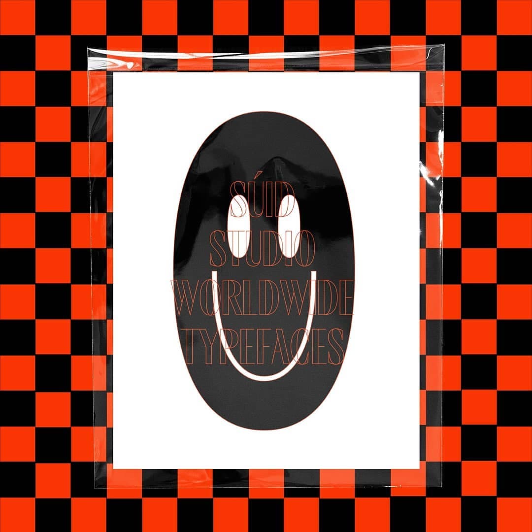
El diseñador chileno David Súid (Santiago, 1991) es parte del equipo W. Su mano y su talento están detrás de algunas de las tipografías más vendidas y apreciadas de nuestro catálogo: Hartwell, Armin Grotesk, Friends, Armin Soft y, la más reciente incorporación, Moncler. Con un estilo definido que se decanta hacia el diseño postmodernista, las tipografías de David incorporan elementos del pasado y del presente, así como un factor emotivo en el proceso creativo. Él mismo nos lo cuenta en esta entrevista.
Adriana Conde —
IG @suidstudio.ttf
Cuéntanos un poco sobre tí, ¿cómo fue tu infancia y adolescencia? ¿Recuerdas algún hecho, situación, experiencia, persona, etc., que influyera en que te dediques actualmente al diseño?
Mi infancia la pase en la calle jugando a la pelota, y también en casa jugando a la Play Station con mis amigos. Mi adolescencia la pasé en el colegio jugando basket. En cuanto a influencias la verdad no tuve ninguna, solo mis padres que siempre me dijeron que estudiara algo que me gustara.
¿Cómo llegas al mundo del diseño? ¿Y al del diseño de tipografía?
Al diseño llegué por casualidad. Ni siquiera sabía qué estudiar cuando salí del colegio, me puse a leer sobre carreras y el diseño me medio convenció, para, finalmente, terminar gustándome mucho. En la escuela de diseño nunca me enseñaron nada de tipografía y siempre quise saber más sobre el tema, aunque en la universidad no me motivé a aprender o a investigar más sobre la disciplina. En mi último año, mientras hacía mi proyecto de título, supe de los diplomas de tipografía que se hacían en Chile y, como en esa época estaba un poco perdido respecto a lo que quería dentro del diseño, decidí tomar el diplomado de tipografía de la Universidad de Chile. Ahí conocí al equipo de W. Como resultado de ese diploma diseñé una tipografía muy mala, pero que en realidad no me importo mucho porque mi intención era otra: aprender y entender lo más posible para hacer algo mejor en el futuro. Después del diploma estuve casi un año trabajando en una oficina y, en febrero de 2018, me decidí a intentar hacer una fuente. Desde entonces solo me dedico a la tipografía con la ayuda de todos en W.
¿Cuáles son tus referentes e influencias al diseñar?
Mis referentes, más que diseñadores de fuentes, son tipografías. Siempre que encuentro o veo una tipografía que me gusta, la estudio e intento entender qué es lo que la hace especial y por qué me gusta tanto. Mis influencias provienen de muchos lugares; me gusta el mundo de la moda en cuanto a la conceptualización y las estrategias de diseño, el arte postmoderno, el diseño de estilo suizo, las zapatillas, el anime, los autos, las series, la tecnología..., en realidad, cualquier cosa que en cierto momento me haga sentido.
Como en todo, en tipografía cada uno tiene su metodología y proceso creativo, ¿cuáles son los tuyos? ¿Piensas en términos comerciales antes o durante este proceso?
Siempre que tengo una idea sobre tipografía la anoto o la dibujo con observaciones del momento. En términos productivos, empiezo por definir el estilo de mi fuente, después decido las proporciones y empiezo a dibujar en el compu, hago el glifo o los glifos que creo que muestran todas las características que tendrá la tipografía, después de eso básicamente relleno el set, hago otros masters, interpolo, defino parámetros y cosas técnicas. Termino con el espaciado y el kerning (después de muchas correcciones, claro). Comercialmente siempre tengo la esperanza de que me vaya bien para poder seguir viviendo solo de hacer tipografía, pero no pienso en cómo se va a vender antes de diseñar, solo hago fuentes pensando en cosas que me gustan en ese momento.
"NO PIENSO CÓMO SE VENDERÁ UNA TIPOGRAFÍA ANTES DE DISEÑARLA"
En base a eso, ¿cómo describirías el estilo “Súid”?
Lo definiría como “lógico”; siempre intento definir cosas para tener mis ideas más claras y sigo ciertos pasos para concretar cada proyecto. Aún no logro llegar al estilo que quiero llegar, pero lo tengo claro. Quiero hacer tipografías postmodernas enfocándome en la versatilidad y en la combinación de nuevas formas para lograr sistemas contemporáneos sin caer en la literalidad de las formas.
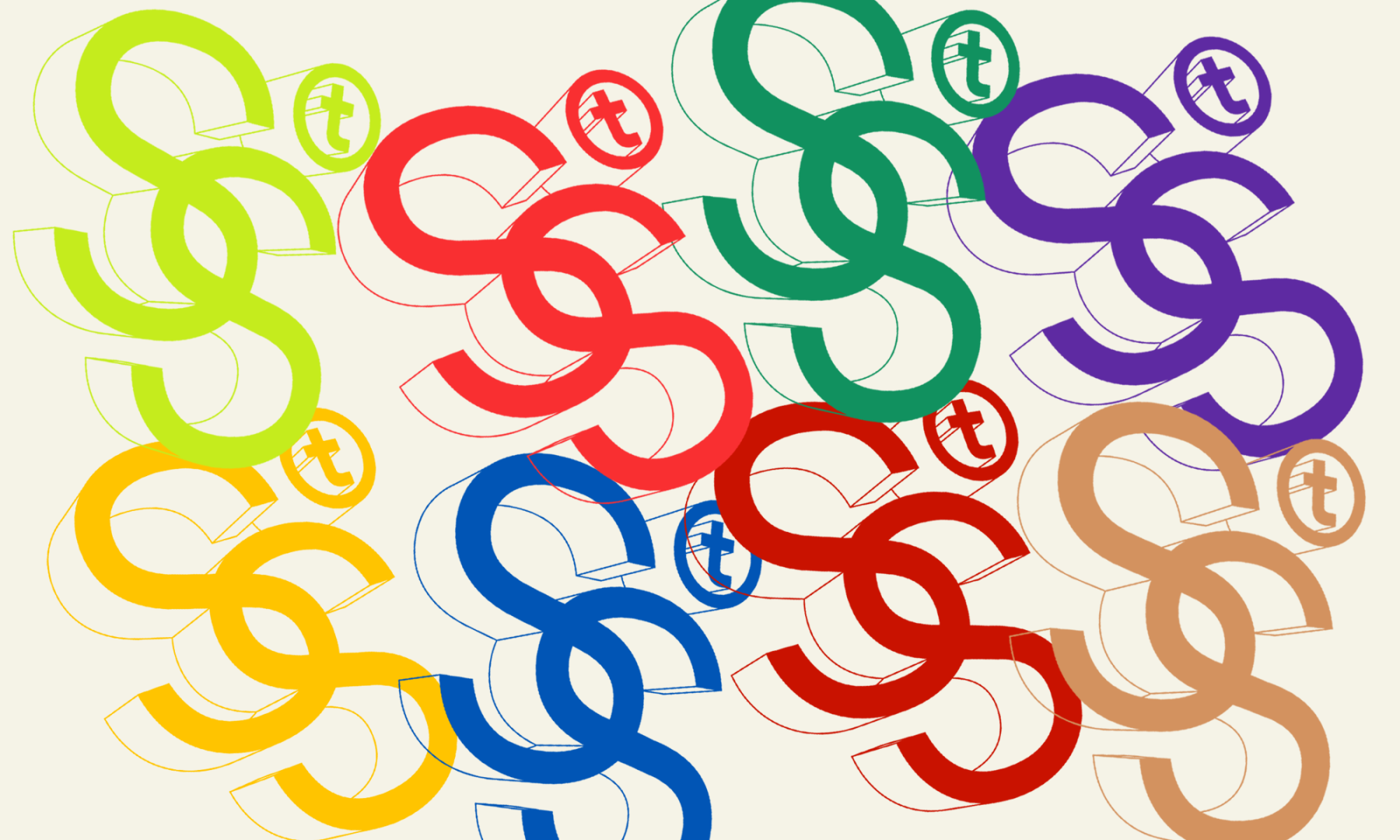
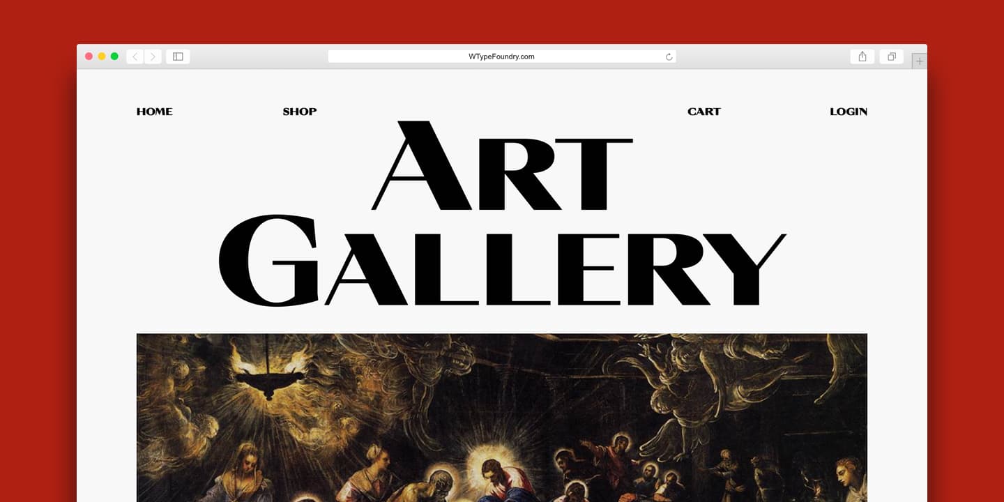
Hablemos de Armin Grotesk, es tu tipografía más popular, es la tipo oficial de W y de nuestra página web. Además cuenta con una versión soft ¿cómo surge la idea original y a qué crees que se debe su popularidad? ¿Por qué decides darle ese nombre?
Este proyecto nace de la búsqueda de proporciones clásicas en combinación con trazos contemporáneos, esa combinación hizo que me llevara bastante tiempo sistematizar el lenguaje. Sobre su “popularidad” creo que se debe a su versatilidad, básicamente sirve para todo, aún así tiene mucha personalidad con todos sus detalles y sus sets alternativos, a mi en particular me gustan mucho. Estoy muy contento de que sea la tipo utilizada en la web de W, que mejor reconocimiento que ese.
En cuanto al nombre, en la última etapa de Armin, estuve viendo mucho el trabajo de Armin Hofmann, un diseñador suizo muy famoso por sus composiciones y diseños de posters, y decidí usar su nombre en la tipografía a modo de homenaje.
"SOBRE SU “POPULARIDAD” [ARMIN GROTESK] CREO QUE SE DEBE A SU VERSATILIDAD, BÁSICAMENTE SIRVE PARA TODO, AÚN ASÍ TIENE MUCHA PERSONALIDAD CON TODOS SUS DETALLES Y SUS SETS ALTERNATIVOS"
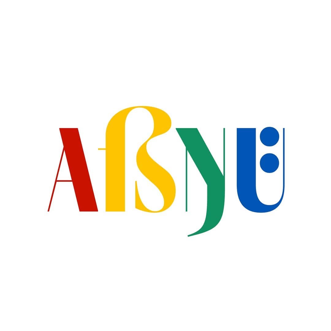
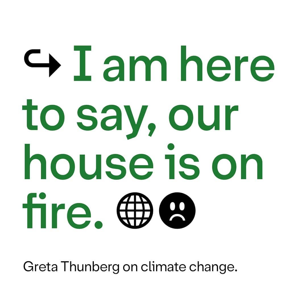
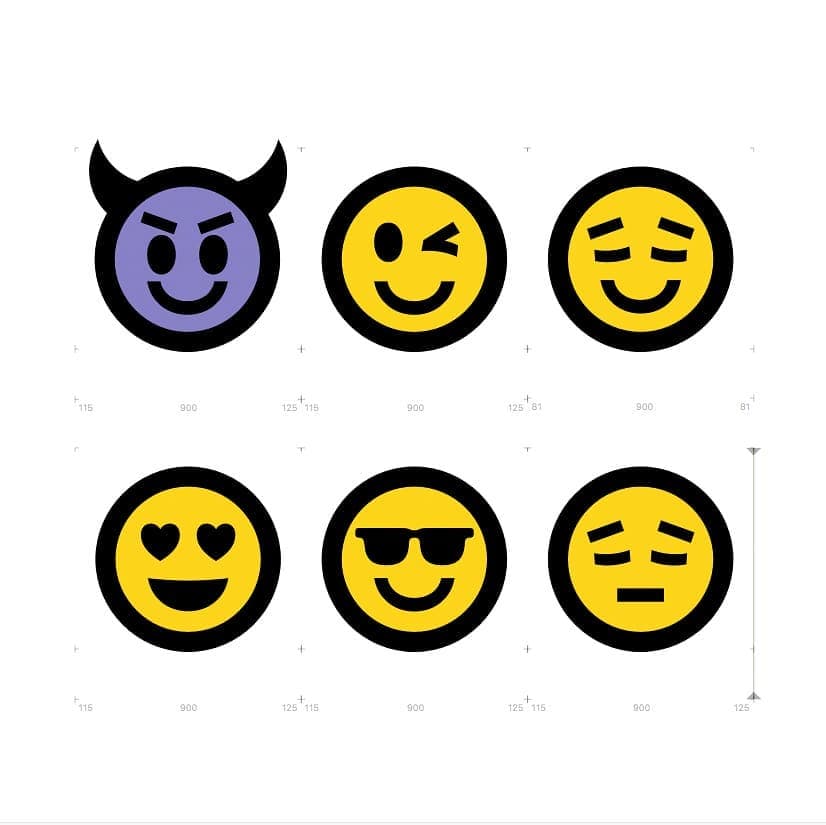
Tu tipografía Friends, plantea un estilo contemporáneo, con énfasis en el lenguaje visual, con emojis y símbolos como protagonistas. ¿Por qué darle importancia a este lenguaje? ¿Qué respuesta obtuviste por parte del público una vez lanzada?
En un principio Friends solo tenía un par de emojis e íconos, pero ví un post en Instagram que decía algo así como “tus 5 primeros emojis más usados definen tu personalidad”, e intenté agregar los emojis que más usaba al set de Friends. Después de algunos intentos entendí que no podía agregar emojis al azar porque muchos tienen sus pares, por ejemplo la carita feliz y la triste.
Respecto a los emojis como lenguaje, hoy en día son protagonistas de la comunicación cotidiana, los emojis son transversales a lenguas o culturas, hay un “entendimiento global” en torno a su significado, creo que eso los cataloga como uno de los idiomas más importantes del mundo. La respuesta en redes sociales fue buena, creo que implementar los emojis llamó la atención y se sintió como algo fresco.
"LOS EMOJIS SON PROTAGONISTAS DE LA COMUNICACIÓN COTIDIANA, LOS EMOJIS SON TRANSVERSALES A LENGUAS O CULTURAS"
Como diseñador con cierta experiencia en la tipografía, ¿qué consejos le darías a alguien que quiere empezar en este campo? ¿Cuál es la formación necesaria para ser tipógrafo? ¿Nos recomiendas algún libro o manual?
A cualquiera que realmente quiera hacer tipografía le diría que se atreva y que renuncie a la falsa definición de éxito que es tener un empleo tradicional. En cuanto a la formación, los diplomados que existen son muy buenos y necesarios para entender lo básico de la tipografía considerando las dimensiones de la disciplina. Recomiendo cualquier libro de tipografía que no sea un manual paso a paso de como hacer una fuente digital.
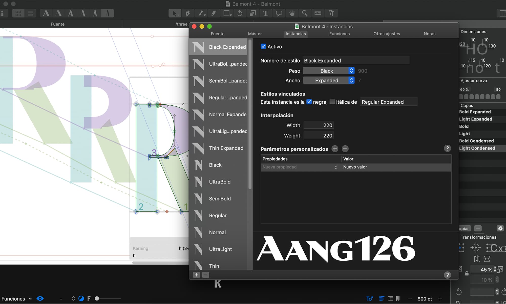
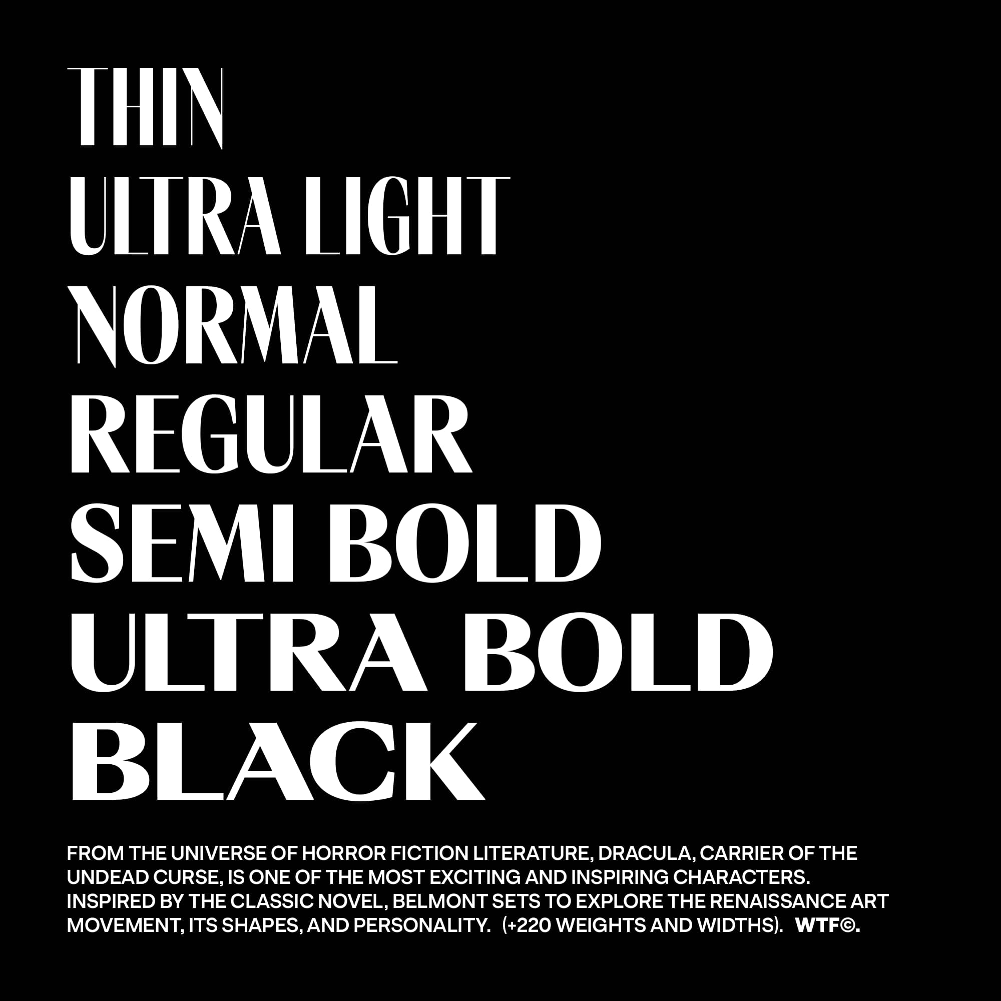
Tu última tipografía es Moncler, una tipo estilo didona con posibilidades casi infinitas gracias a su característica variable. Cuéntanos un poco más sobre la tipo. ¿Cuál fue tu inspiración y motivación tras el proyecto?
La idea para Moncler (originalmente llamada Belmont) surgió viendo Clastlevania, un videojuego que ahora es una serie en Netflix. Inspirado por la estética en torno al personaje de Drácula dibuje una serie de glifos pensando en desarrollar una tipografía en poco tiempo.
Finalmente terminé haciendo una fuente mucho más extensa con 6 másters, pesos de thin a black y anchos de condensed a expanded. Entre idas y vueltas en torno al desarrollo, funcionamiento y programación me tomó más de 6 meses terminarla. La motivación siempre es la misma, intentar proponer algo nuevo experimentando con el funcionamiento y las formas.
La venta y creación de tipografías ha tenido que adaptarse a la diversificación de los formatos digitales y físicos a los que van destinadas. Según tu criterio, ¿cuál dirías que es el estado actual del diseño de tipografía? ¿Cuáles son las nuevas tendencias? ¿Alguna predicción de lo que sucederá en el futuro?
Creo que la tipografía está en una transición de función y estilo. A mi parecer, las tendencias apuntan más hacia al arte. Mis predicciones… grandes retos para los sagitarios, número de la suerte el 24, color esmeralda (risas).
“A CUALQUIERA QUE REALMENTE QUIERA HACER TIPOGRAFÍA LE DIRÍA QUE SE ATREVA Y QUE RENUNCIE A LA FALSA DEFINICIÓN DE ÉXITO QUE ES TENER UN EMPLEO TRADICIONAL”
¿En qué estás trabajando ahora? ¿Puedes anticiparnos algo sobre una nueva tipografía?
Ahora estoy trabajando en mi primera tipografía de texto continuo. Se aleja de una tipo de texto tradicional, estoy mezclando un lenguaje display con trazos funcionales para composición.

"LA MOTIVACIÓN SIEMPRE ES LA MISMA, INTENTAR PROPONER ALGO NUEVO EXPERIMENTANDO CON EL FUNCIONAMIENTO Y LAS FORMAS"—