Interview

ENTREVISTA A GASPAR MUÑOZ: DUALIDAD ENTRE TIPOGRAFÍA Y GRAFFITI

A los 13 años Gaspar ya pintaba graffitis, fue ese su primer acercamiento al mundo de la tipografía y el diseño. En la actualidad Gaspar se dedica al graffiti y también es parte del equipo de W TYPE FOUNDRY, su último proyecto Throwup, surge precisamente del mismo pasatiempo que vio nacer su amor por las letras, el graffiti. Hablamos con él sobre la influencia en su trabajo como diseñador y la dualidad entre ambas disciplinas.

Patricio Truenos —

Gaspar nació el 1997 en Santiago. Siempre influenciado por la calle, atraído por las formas, colores y letras de los graffitis que veía ahí, se engancho con la tipografía y el diseño. El 2015 entro a estudiar diseño gráfico y un par de años más tarde participo en uno de nuestros talleres de diseño de tipografía, fue ahí donde lo conocimos.
Un año más tarde, en 2018, realizo su practica con nosotros, periodo en el que ayudo a desarrollar la tipografía Sonny Gothic Vol 2. En 2019 cursó el diplomado de Tipografía de la Universidad Católica.

Desde su practica en 2018 ya es uno más en W TYPE FOUNDRY, hasta ahora autor de las tipos Mamba, Munchies y la más reciente Throwup. Gaspar es un joven talento y así lo ha demostrado con su exploración tipográfica, en esta entrevista nos cuenta sobre el graffiti, sus influencias, tipografía y el resultado de esta mezcla en su último proyecto: Throwup, una tipo de libre descarga.


IG: @Gsprauno

Gaspar, ¿Cómo partiste en el graffiti, hace cuantos años te dedicas a esto?

Siempre me llamaron la atención los muros pintados en la calle, me impresionaba cómo controlaban los trazos, colores y por supuesto las letras. Intentaba descifrar lo que decía cada tag, flop o wildstyle que veía en la calle.

Empece a los 13 años (2009) hubo un boom de la cultura Hiphop y con un grupo de compañeros de curso nos fuimos motivando, practicando rap y haciendo graffitis. En poco tiempo me di cuenta que las rimas y el rap no eran lo mío. Desde ahí me dediqué completamente a dibujar y pintar graffitis. Salíamos a pintar casas abandonadas cerca del colegio, debajo de los puentes y a rayar las micros. Íbamos todas las semanas al Eurocentro (punto neurálgico de la cultura pop y under de Santiago en las últimas décadas) a comprar latas, tintas o lo que encontráramos para dejar alguna marca, nos devolvíamos pintando o rayándolo todo.

Boceto de graffiti del año 2011
"EN POCO TIEMPO ME DI CUENTA DE QUE LAS RIMAS Y EL RAP NO ERAN LO MÍO. DESDE AHÍ ME DEDIQUÉ COMPLETAMENTE A DIBUJAR Y PINTAR GRAFFITIS."

El graffiti tiene íntima relación con las letras de forma gestual, casi como una coreografía. Es similar a la tipografía, pero no es tipografía tal como la conocemos. ¿Cómo partiste en la tipografía?

Comencé a fijarme en la tipografía después de empezar a pintar. En general pintaba las mismas letras, pero cuando tenia que escribir con letras que no acostumbraba hacer, me quedaban horribles. Eso me llevó a buscar referencias de familias de letras, ahí conocí Dafont.

Me intrigaba cómo hacían esas tipografías, quiénes las diseñaban y por qué las subían. Años después entré a estudiar diseño gráfico, en una de las primeras clases, un profesor nos hablo sobre la importancia de la tipografía en el diseño - "acá tienen una página super buena para descargar fuentes" - era Dafont.

En ese momento me entusiasmé mucho porque la carrera tenía relación con mis intereses de siempre. Mi clase favorita era tipografía y como nunca, entraba motivado a clase, entregaba mis trabajos a tiempo, llegaba temprano y hasta tomaba apuntes.

Al año siguiente (2018) hice mi práctica en W, y me quedé como colaborador y desde ese entonces hasta ahora he publicado 3 tipografías: Mamba, Munchies y Throwup.

Mamba Font
Mamba 2020
Munchies font
Munchies 2021
"ME GUSTA TENER ESTA DUALIDAD, EN LA QUE ÚNICAMENTE SE COMPARTEN LAS LETRAS."

Tu última tipografía es Throwup una tipo gratuita, fuertemente influenciada por el graffiti en su forma. Además explora la tecnología de las tipografías con color, Color Fonts. Cuéntanos sobre el proceso creativo detras de Throwup. 

Desde el colegio, siempre quise hacer una tipografía de graffiti. Las que encontraba en Dafont no me gustaban, y las que me gustaban eran pagadas y no iba a gastarme la plata del almuerzo en una tipografía, quería hacer la mía.

Aproveche el diplomado de tipografía para finalmente hacer la tipografía de graffiti. Por un lado mi dibujo de letras con su estilo y forma definidos y por otro, los gestos de la pintura con spry, como la transición de los trazos dependiendo de los caps o válvulas. (Mis caps preferidas, Punto Rosa o Ny Fat cap para transiciones más extremas.)

Al comienzo fue difícil sistematizar las formas, cuando pintas en la calle no hay patron establecido. En los flops no existen ascendentes o descendentes y en general se mezclan minúsculas y mayúsculas. Además no existe el espaciado, normalmente las letras se sobreponen unas con otras, un rasgo importante que quería replicar en la tipografía.

Una "Guaguita" (flop pequeño) al costado de un tren
Flop de Gaspar junto a Andres Vega en el rio Mapocho, Santiago.
"LOS PROCESOS SON MUY DIFERENTES, UNA TIPOGRAFÍA PUEDE TOMAR 5 MESES O MÁS. UN FLOP ME TOMA DE 10 MINUTOS A 1 HORA DE SER MUY ELABORADO."

Por temas de tiempo no logre terminar el proyecto al 100% dentro del diplomado, al año siguiente la retomé para terminarla, añadí caracteres especiales, ligaduras, capitulares, letras finales, etc. Para los Color Fonts tuve que buscar un poco más ya que no es tan común, busqué en algunos foros (Glyphs, TypeDrawers) cómo aplicar el color, hasta que me resultó.

La publiqué gratis a través de Behance y le fue super bien, la descargaron mucho, pero la empezaron a subir a portales de tipografías gratuitas sin mi permiso. Decidí bajarla ya que no tenia ninguna licencia que limitara su uso con fines comerciales o de empresasLe pregunté a la Bana (socia de WTF) si podía publicarla gratis a través de la página de W y ahí sumaron la licencia de uso personal. Le hice un par de cambios más, sumé las sombras, los brillos y tomé 4 combinaciones de colores que en general se usan (o yo uso) en los flops para completar la familia.

Throwup Font
Throwup Font

¿Cómo se mezcla la calle y la disciplina del diseño tipográfico?

Son opuestos, para mí el graffiti es una actividad sin ningún tipo de regla, temática o idea determinada. No le pertenece a un movimiento artístico ni académico. Mientras que la tipografía es todo lo contrario, es una disciplina con muchas reglas y normas, se debe estudiar, entender y practicar.

Los procesos también son muy diferentes, una tipografía puede tomar 5 meses o más. Un flop me toma de 10 minutos a 1 hora de ser muy elaborado. Me gusta tener esta dualidad, en la que únicamente se comparten las letras. En una puedo hacer lo que quiera (colores, formas, muros, etc.), en la otra sigo parámetros más establecidos y un orden a la hora de diseñar.

Throwup versión en capas
Throwup Font
Throwup Color Font

¿Qué estás diseñando ahora?

Estoy diseñando una familia Sans-Serif grotesca, con variantes de peso y diferentes anchuras. Y si bien la familia ya está bastante avanzada, aún le estoy ajustando detalles y corrigiendo junto al Diego y el Deivid, para que sea una tipografía más singular y llamativa.

DESCARGA THROWUP GRATIS —

AN INTERVIEW WITH GASPAR MUÑOZ: THE DUALITY BETWEEN TYPOGRAPHY AND GRAFFITI

IG: @Gsprauno

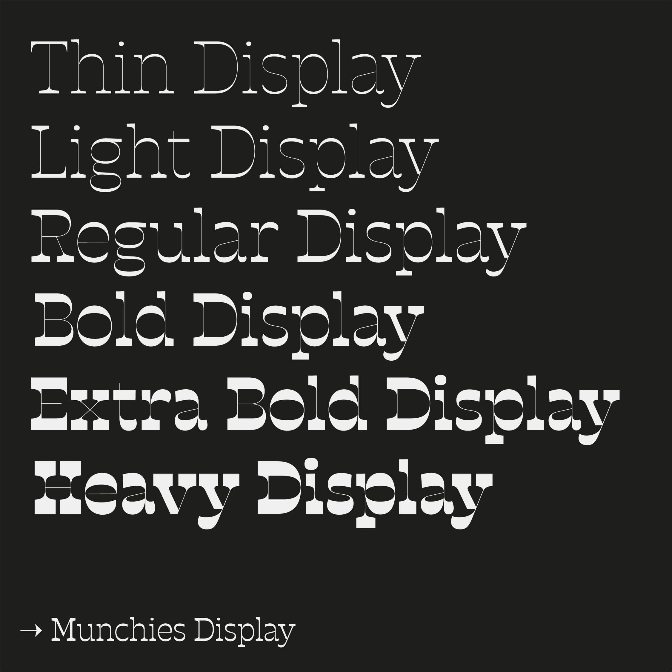
Gaspar was born in Santiago in 1997. He began studying design in 2015. Drawn initially to the streets, he developed a growing interest in typography when he started going out to paint with his friends at 13. He attended one of our workshops a few years ago, followed by the Typography diploma course at UC (Catholic University). His typefaces Mamba, Munchies and Throwup (his most recent work) have been published by W TYPE FOUNDRY.

Gaspar, how did you get started in graffiti, how long have you been doing it?

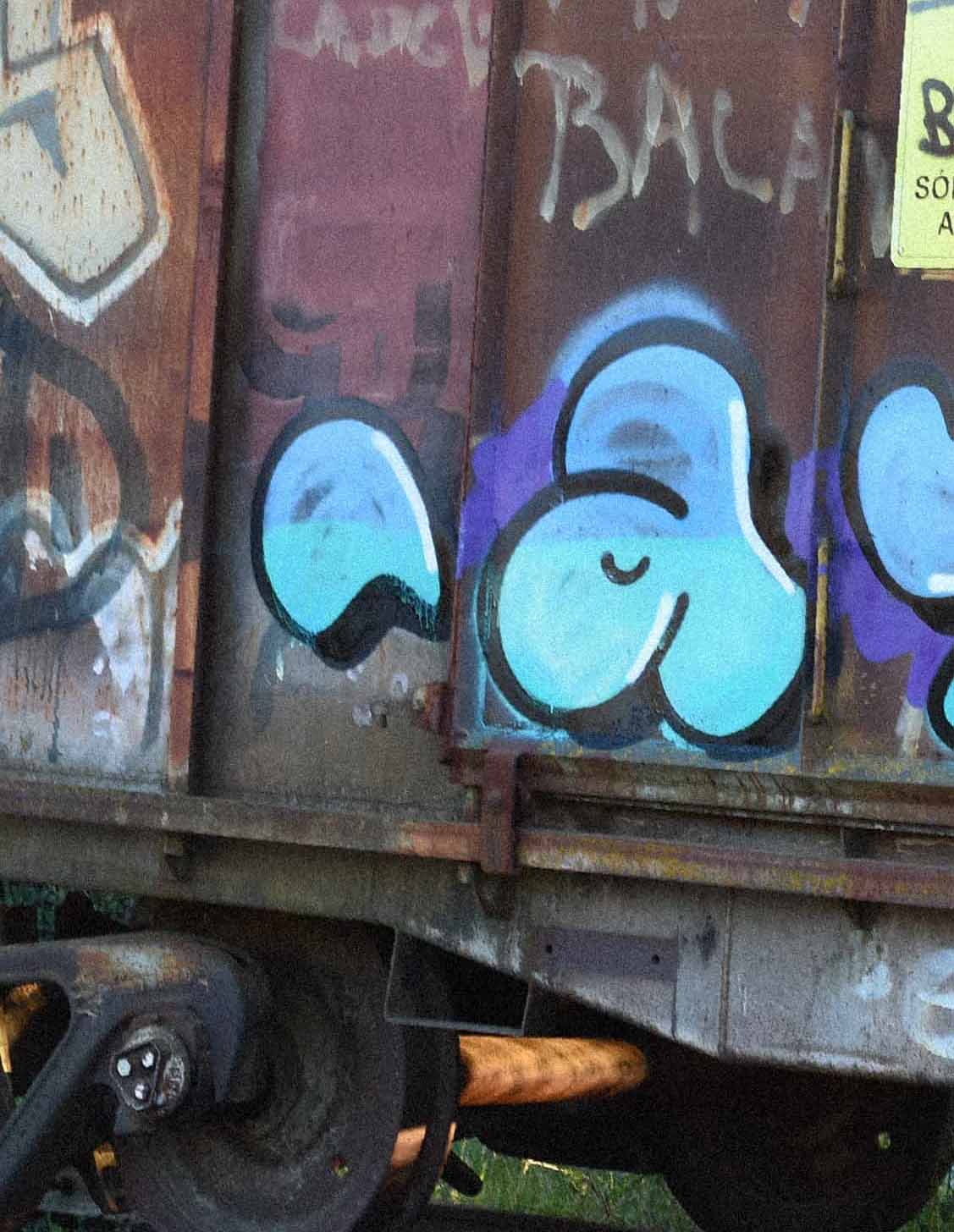
I was always drawn to painted walls in the street. I was impressed by how the artists controlled the strokes, the colors and of course, the letters. I was always trying to decipher what each tag, flop or wildstyle I saw out there meant.

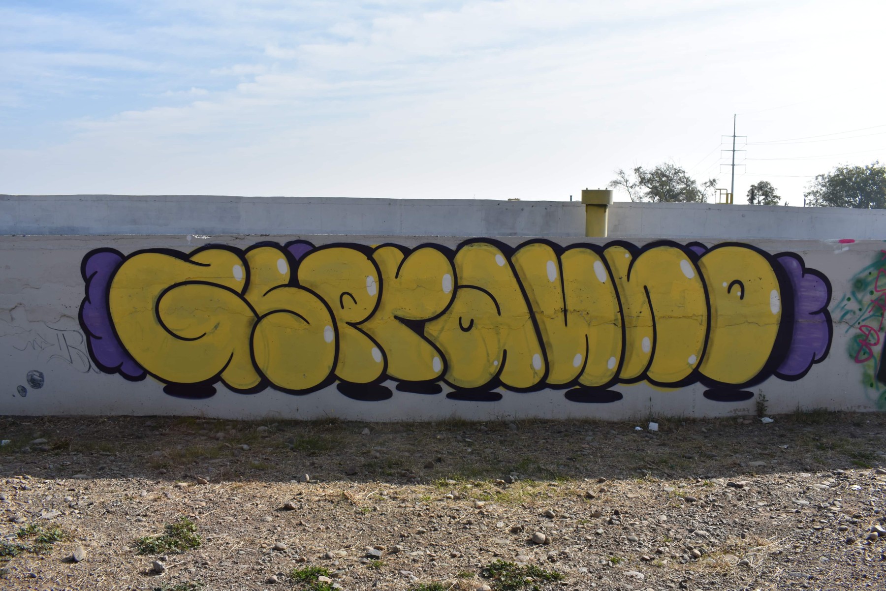
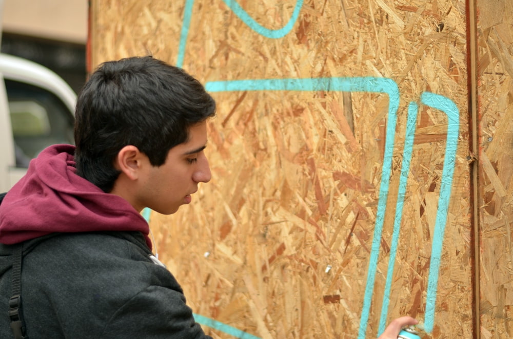
When I was in 7th grade (aged 13), around 2009, hip hop culture was booming and a group of my classmates and I got very into it. It motivated us to start rapping and doing graffiti. I soon realized that the rapping part wasn't my strong suit, but that's when I threw myself completely into drawing and painting graffiti. We would go out to paint abandoned houses near our school, under bridges, and to tag buses. Each week we'd go to Eurocentro (a mainstay of Santiago's pop and underground culture for the last few decades) to buy spray paint, inks or whatever we could find to leave a mark, painting and tagging everything on our way back.

Graffiti sketch, 2011
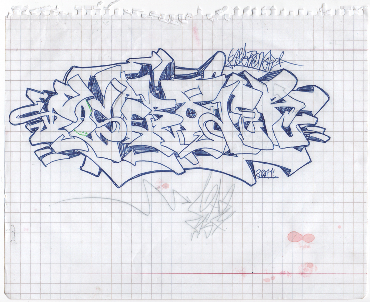
I SOON REALIZED THAT THE RAPPING PART WASN'T MY STRONG SUIT, BUT THAT'S WHEN I THREW MYSELF COMPLETELY INTO DRAWING AND PAINTING GRAFFITI.

Graffiti is intimately related to letters in a gestural way, like a choreography of writing. It is related to typography but not exactly typography as such. How did you arrive at type design?

I first encountered it in school, soon after I began to paint. I would always make the same letters whenever I painted, but when I had to do letters that I wasn't used to, they'd look horrible. That led me to search for fonts with similar looks to use as references, and that's how I came across Dafont.

I was intrigued by how the typefaces were made, who was behind them and why they uploaded them. Years later I started studying graphic design, in one of the first classes, a teacher told us about the importance of typography in design - "this is a great website to download fonts" - it was Dafont.

That's when I got really excited because I felt I wasn't making a mistake in choosing that major, that it related well to my existing interests. Typography classes were my favorite I felt motivated to go to class as never before, handed in my work on time, arrived early and even took notes.

The year after that (2018) I did an internship at W, and I never left. I have already published 3 typefaces as a collaborator: Mamba, Munchies and Throwup.

Mamba W Type Foundry
Mamba 2020
Munchies W Type Foundry
Munchies 2021
"I LIKE THAT KIND OF DUALITY, WITH LETTERS AS THE SOLE SHARED ELEMENT"

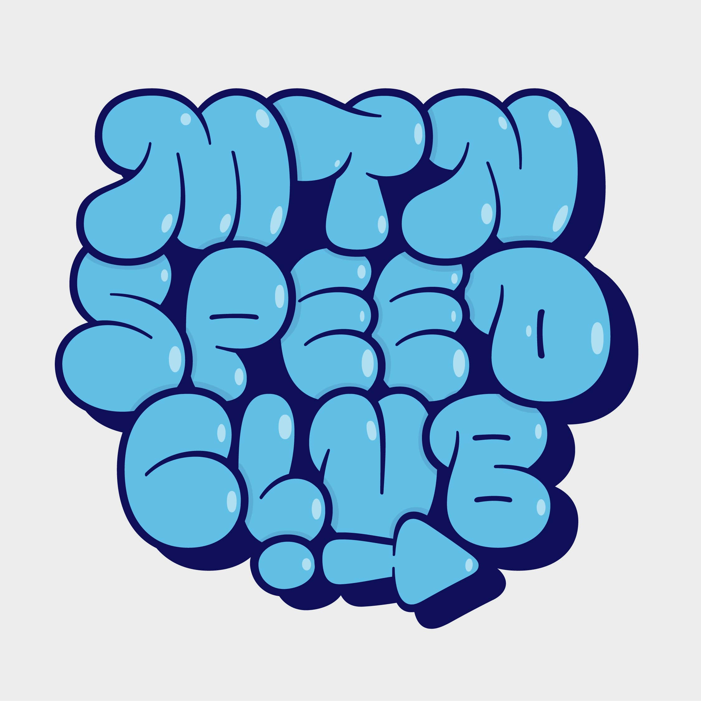
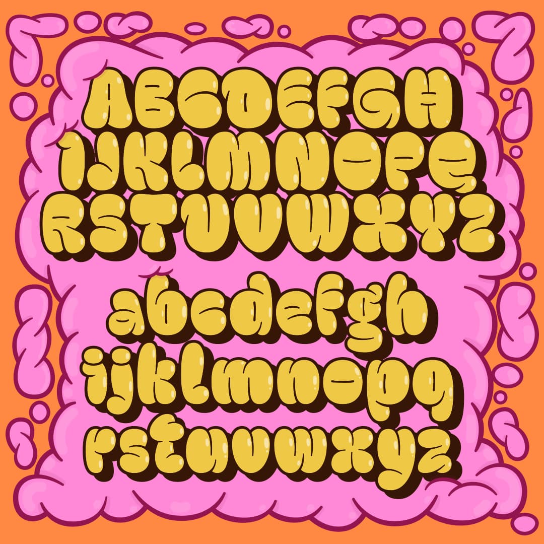
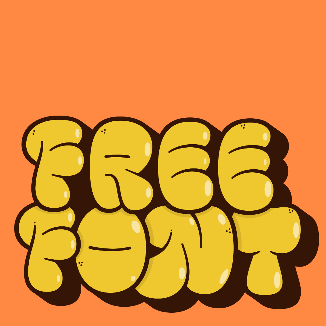
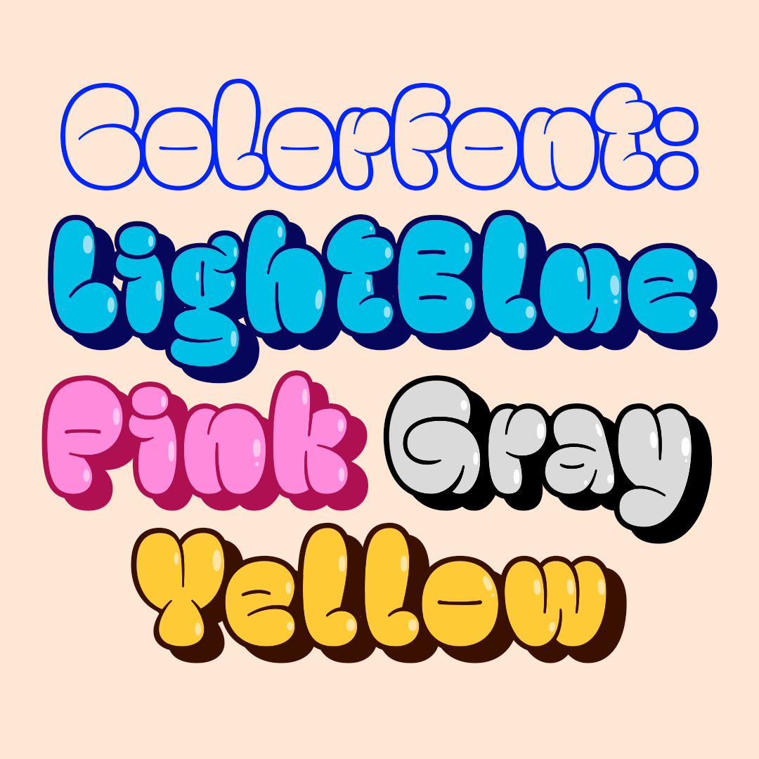
Your latest typeface is Throwup, a free download font heavily influenced by graffiti in its form. It also explores the technology of Color Fonts. Tell us about the creative process behind Throwup.

I had always wanted to do a graffiti font, since I was a schoolboy. I didn't like the ones you could get at Dafont and the ones I liked weren't free, and since I wasn't about to spend my lunch money on fonts, I wanted to make my own.

When I entered the typography diploma I decided it was time to finally make that graffiti font. I was already drawing letters in a defined style, and I wanted to incorporate some gestures that I used in my paintings, like the stroke transitions from caps or valves. I usually go with the wider Pink Dot or Ny Fat caps that give you more extreme transitions.

At first, It was difficult to systematize shapes, when you paint in the street there is no established pattern. Flop style mixes lowercase and uppercase, and there are no ascenders or descenders. Also there is no spacing, normally the letters overlap each other, an important feature that I wanted to replicate in the font.

"THE PROCESSES ARE ALSO VERY DIFFERENT, A TYPEFACE CAN TAKE 5 MONTHS OR MORE. A FLOP TAKES ME ALL OF 10 MINUTES, AN HOUR IF IT'S VERY ELABORATE"

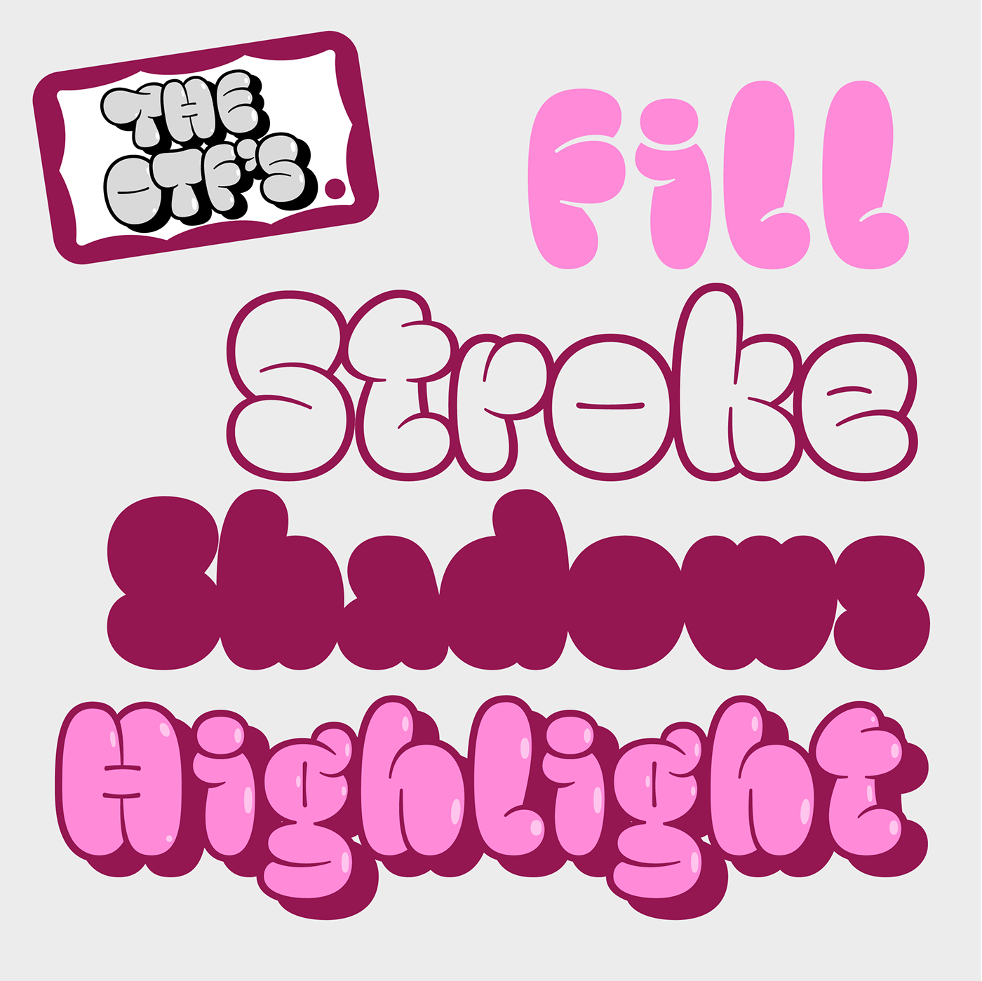
Due to time issues, I couldn't finish the project 100% within the diploma, the following year I took it up again to finish it, I added special characters, ligatures, alt Caps, final letters, etc. For the Color Fonts, I had to search a bit more since it is not that common, I looked in some forums (Glyphs, TypeDrawers) how to apply the color until I made it work.

I published it on Behance and it did really well. It got a ton of downloads, but people started uploading it to free font websites without my permission. It didn't have a license either, any company could use it without paying a dime, so I pulled it from the Behance. I asked Bana (one of the partners at WTF) about the possibility of publishing it through W's website for free. They added the personal non-commercial use license, I made a couple more changes, added shadows, highlights and 4 Color Font combinations that are highly used in flops (at least by me) to round out the family.

How do the street and the discipline of type design mix, are these compatible?

They are opposites, for me, graffiti is an activity without any kind of rule, theme, or specific idea. It does not belong to an artistic or academic movement. While typography is the opposite, it is a discipline with many rules and regulations, it must be studied, understood and practiced.

The processes are also very different, a typeface can take 5 months or more. A flop takes me all of 10 minutes, an hour if it's very elaborate. I like that kind of duality, with letters as the sole shared element. In one I can do whatever I want (colors, shapes, walls, etc.), in the other I have to abide by certain parameters that are a bit more defined, which makes the design process more orderly.

What are you working on right now?

I'm designing a grotesque Sans-Serif family that includes weight variations and different widths. It's very far along but I'm still adjusting various details and making corrections to it with Diego and Deivid, to make it a more unique and eye-catching typeface.

DOWNLOAD THROWUP FREE —